
01 · THE VISION
Defining the character before designing the product
The starting point for CobblerX was not a particular sole, material or silhouette. It was a desired character.
Alfonso envisaged footwear with more visual energy and a stronger technical influence, while remaining firmly within the lifestyle sneaker category rather than becoming performance sports footwear.
This distinction shaped the project from the beginning.
The range needed to feel dynamic without becoming over-designed, contemporary without relying on short-lived visual trends, and recognisable without depending entirely on prominent branding.
That direction provided the foundation for both the identity and the products that followed.
Suggested image: early CobblerX concept or original visual direction.
About the picture: early CobblerX concept and original visual direction.
The founder's initial direction established the X as the central graphic idea and defined the more dynamic character of the project.

02 · BUILDING THE COBBLER X IDENTITY
From an initial direction to a distinctive visual language
The CobblerX identity developed around two fundamental components:
the COBBLER name and the X.
The initial direction drew on visual principles commonly associated with sports and performance branding: bold typography, strong graphic symbols, immediate recognition and a sense of forward motion.
The first composition became the starting point for a process of refinement, reduction and balance.
Seeking balance
The earliest arrangement relied on a relatively symmetrical relationship between the wordmark and the X.
This created visual stability, but also introduced a degree of stillness that did not fully express the intended CobblerX character.
The development process therefore moved towards controlled asymmetry.
Different relationships between the typography and the X were explored, progressively bringing the elements closer together and allowing the X to create greater visual tension and direction.
As the identity became stronger, secondary components were progressively reduced. The objective was to retain only those elements that contributed meaningfully to the mark and allowed it to function across different scales and physical applications.
In the final composition, the outlined X creates an upward diagonal movement. A small solid element positioned above it acts as a visual counterweight, stabilising the composition without cancelling its energy.
The final identity seeks balance not through symmetry, but through counterbalanced energy.
The result is a mark that remains controlled and recognisable while conveying movement, technical character and a distinctly dynamic attitude.
From logo to identity system
The final wordmark was reduced to its strongest components: COBBLER + X.
This simplification also increased its flexibility. The X could operate as a recognisable graphic element in its own right, while secondary brand devices could be adapted to smaller product applications.
This became particularly important when the identity moved from graphic development onto the footwear itself.
About the final logo study
From the founder's initial direction to the final CobblerX identity.
The development moved from visual stability towards controlled asymmetry, using the X and its counterweight to create balance through movement and tension.

03 · FROM IDENTITY TO PRODUCT
Translating visual energy into footwear
CobblerX was never intended to remain a graphic exercise.
The next challenge was to translate the character established through the identity into actual footwear.
Branding, upper design, proportions, materials and colour therefore needed to support one another rather than operate as separate decorative decisions.
Panel layouts became more assertive. Contrasting materials could be used more freely.
Sole profiles contributed to the stance of individual models, while branding was adapted according to the scale and construction of each shoe.
The objective was not simply to place the CobblerX logo onto an existing sneaker.
The product itself needed to feel like CobblerX.
A brand identity only becomes meaningful when it survives contact with the product.
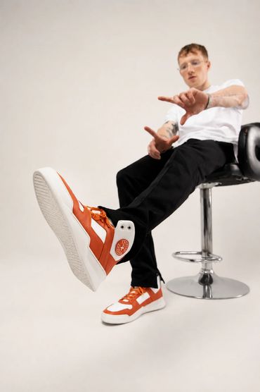
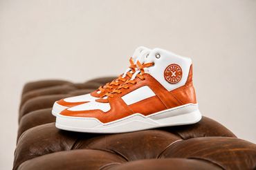
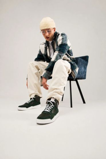
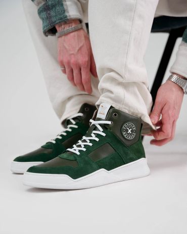
X007 · Where the CobblerX Language Began
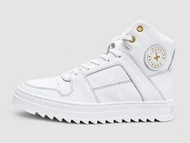
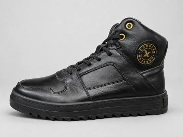
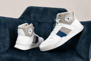
The X007 became the starting point for the CobblerX footwear language.
Conceived as a high-top sneaker with a distinctly sporty attitude, it combined assertive proportions, structured panel construction and visible branding with a more craft-led approach to materials, stitching and finishing.
It established an idea that would remain central to CobblerX: sport-inspired footwear did not need to feel disposable, anonymous or purely trend-driven. It could retain energy and contemporary character while still reflecting careful construction and attention to how a shoe is actually made.
In that sense, the X007 became more than an individual model. It was the first clear expression of the principle behind the range:
Contemporary footwear, made properly.
04 · DEVELOPING THE RANGE

One identity, different footwear expressions
The project expanded beyond a single silhouette into a broader footwear family.
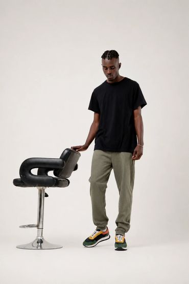
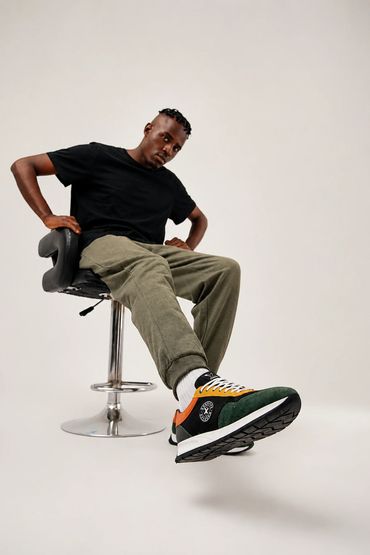
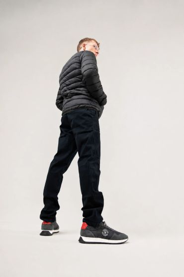
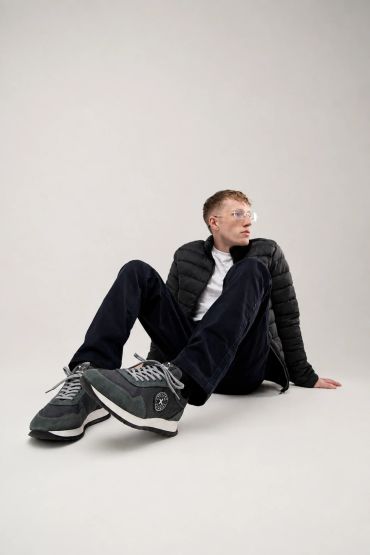
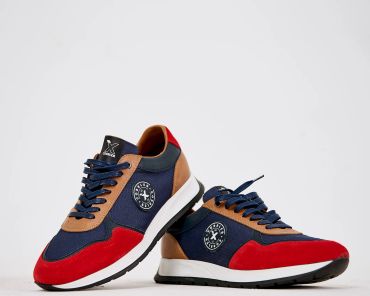
Different models explored the CobblerX character through different proportions, constructions, materials and levels of visual intensity. Runner-inspired designs introduced combinations of suede, textile and leather together with more expressive colour blocking.
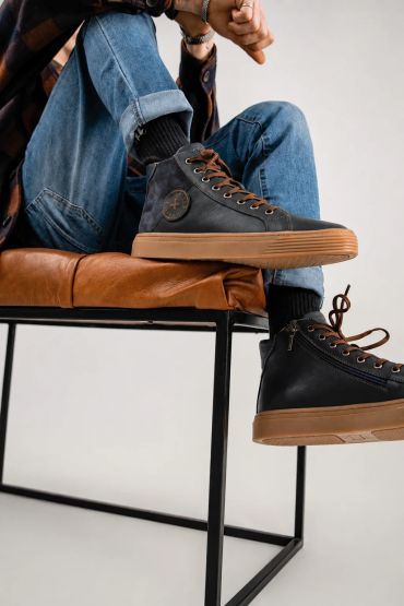
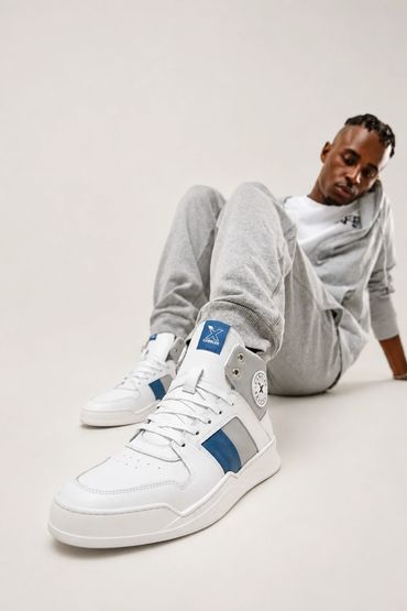
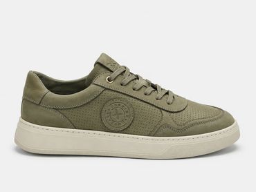
High-top models provided greater opportunities for structured panels and more visible branding, while cleaner low-top styles demonstrated that the identity could also be applied to quieter footwear without losing its underlying character.
CobblerX, however, was never intended to be defined by sneakers alone.
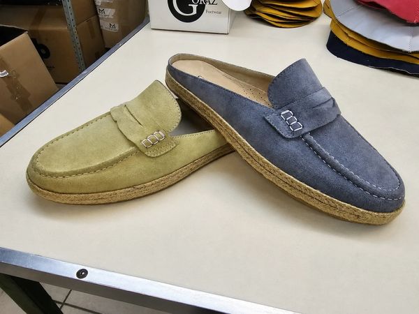
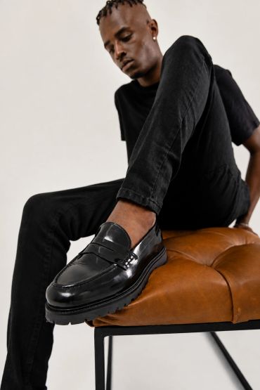
The range also extended into loafers, moccasins and slip-on styles, allowing the brand to explore a more refined interpretation of casual footwear. These models retained the relaxed, contemporary and slightly sporty character of CobblerX, while introducing more traditional constructions, carefully selected leathers and suedes, woven details and considered finishing.
This combination became an important part of the project: footwear that could feel informal and modern without abandoning material quality, construction and manufacturing detail.

A recognisable footwear range should not depend on every product looking identical.
Its identity needs to be strong enough to accommodate variation in silhouette, construction, material and purpose while maintaining a clear relationship between individual models.
The aim was not to make every CobblerX shoe look the same, but to make different shoes feel as though they belonged to the same world.
06 · BRANDING IN THE DETAILS

Designing an identity that works at product scale
One of the less visible but important parts of footwear development is translating brand identity into small physical applications. A logo that works perfectly on a screen or shoebox does not automatically work on a tongue label, leather badge or insole.
Scale, contrast, material, production method and position all affect how successfully an identity survives the transition into product.

The circular badge became particularly useful as a compact secondary identifier, while variations of the X allowed the identity to remain visible even where the complete wordmark would have been impractical.
Multiple touchpoints
CobblerX branding was therefore adapted across multiple touchpoints, including tongue labels, side badges, insoles and other product details.
07 · PACKAGING THE PRODUCT
Extending the identity beyond the shoe
Packaging provided another test of whether the CobblerX identity could operate as a complete system rather than simply as a footwear logo.
The oversized X became a strong structural element across the box design, while the wordmark remained clear and immediately recognisable.
Different finishes and treatments were explored, including both kraft and white versions, before the packaging language was refined around strong contrast, limited typography and confident use of the brand symbol.
The result extended the Cobbler X experience beyond the footwear itself and helped establish a more complete market-facing product presentation.
08 · FROM DEVELOPMENT TO MARKET
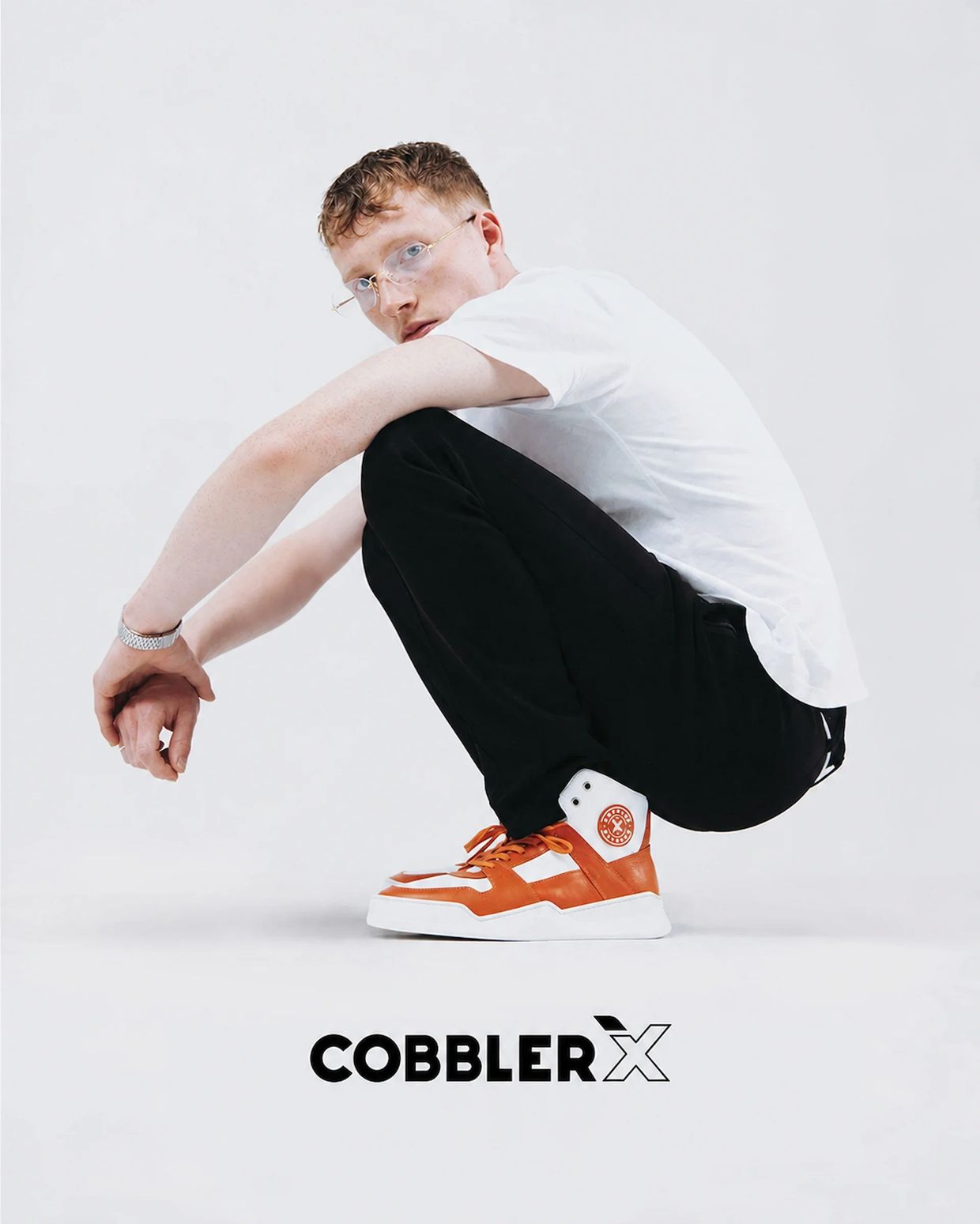
THE IDEA BECAME A REAL PRODUCT RANGE
The final stage of CobblerX was not a presentation rendering.
It was physical footwear.
Multiple styles progressed into actual products and became part of the commercial range, allowing the original concept to be tested not only visually but as footwear intended to be worn and sold.
This transition is fundamental to footwear development.
A successful concept must eventually reconcile design intent, materials, branding, construction, comfort and manufacturing requirements.
CobblerX progressed through that process from an initial direction to a physical product family.
The resulting models represented different interpretations of the same direction, from more technical and visually expressive sneakers to more restrained everyday styles.
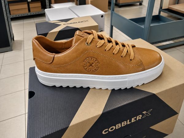
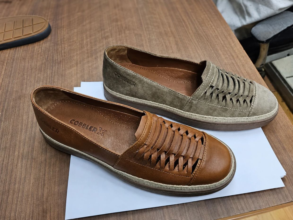
A transition fundamental to footwear development.
A successful concept must eventually reconcile design intent, materials, branding, construction, comfort and manufacturing requirements.
CobblerX progressed through that process from an initial direction to a physical product family.
CobblerX Sneakers Range / Collection Development
09 · THE OUTCOME
From an idea to a complete footwear proposition
CobblerX demonstrates how an initial product vision can develop into a coherent relationship between identity and physical product.
What began as Alfonso Smerilli's direction for a more technical, energetic sneaker concept evolved into a recognisable family of footwear with its own visual language, product details and packaging.
For Smerilli Design Manufacturing, the value of the project lies not simply in the finished sneakers.
It demonstrates how concept development, visual identity and footwear design can be considered together, with each decision ultimately needing to survive the realities of physical production.
Design creates the direction. Development determines how that direction becomes product.

WHAT THE PROJECT DEMONSTRATES
- Concept Direction: defining a clear product character before development begins.
- Visual Identity Development: transforming an initial direction into a flexible brand system.
- Footwear Design: translating visual principles into physical products.
- Range Development: extending a shared design language across different sneaker styles.
- Material & Colour Development: using material combinations and colour to support individual silhouettes.
- Brand Application: adapting identity across footwear components and packaging.
- Production Development: moving beyond concept imagery into physical, market-facing footwear.